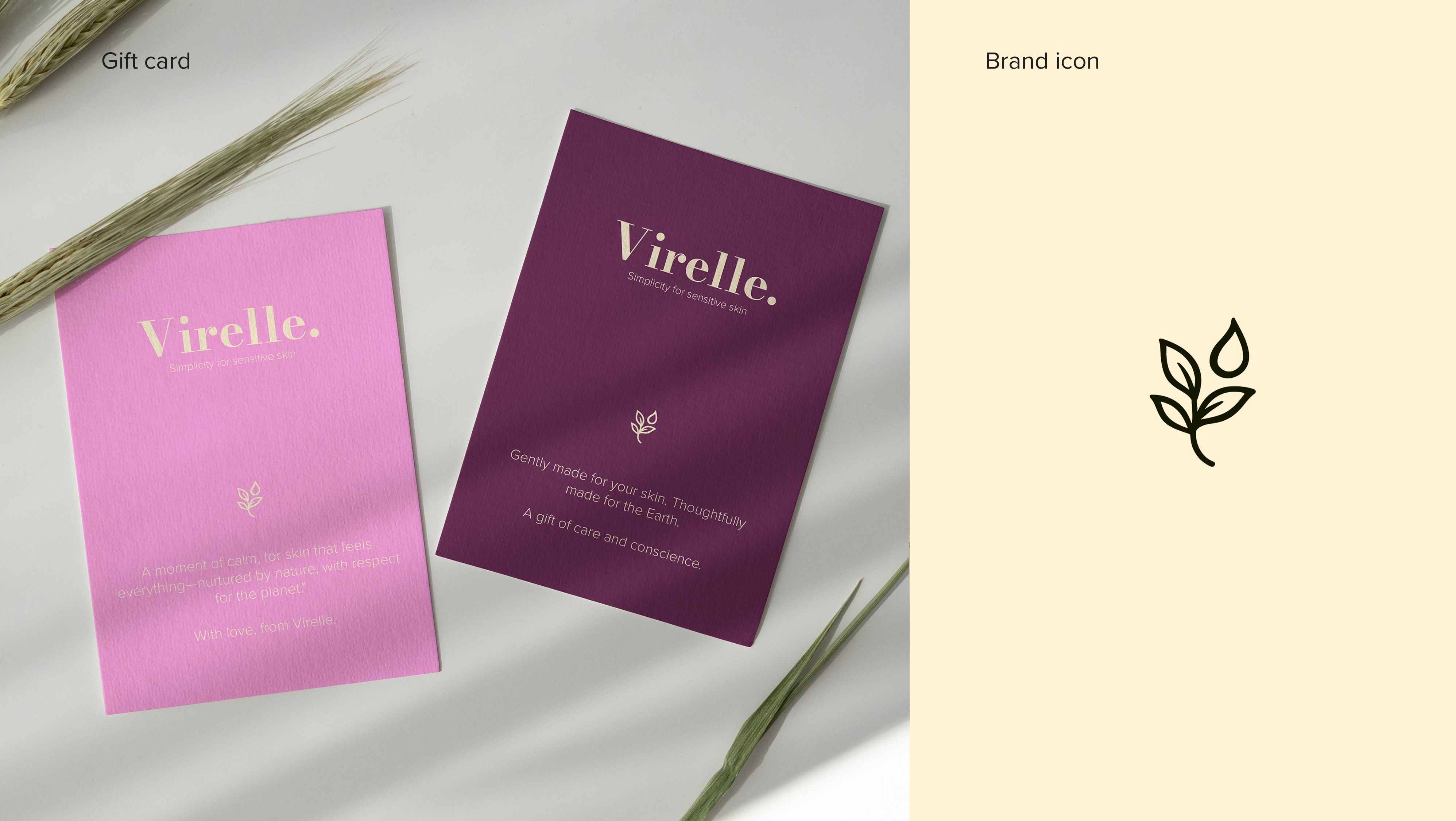
Virelle is a skincare brand born from softness—celebrating real skin, especially fair and sensitive tones often overlooked by the beauty industry. My role as Art Director was to shape a visual identity that mirrors this philosophy: gentle, authentic, and rooted in nature.


From branding to packaging and campaign art direction, I crafted a minimal yet emotive design language. The palette reflects the ingredients—green tea, oat extract, and centella asiatica—while the typography and photography embrace softness, individuality, and calm.
Every element was chosen to resonate with Virelle’s belief: real skin is enough. The result is a brand that feels honest and nurturing, with a quiet elegance that stands out by being subtle.
Every element was chosen to resonate with Virelle’s belief: real skin is enough. The result is a brand that feels honest and nurturing, with a quiet elegance that stands out by being subtle.